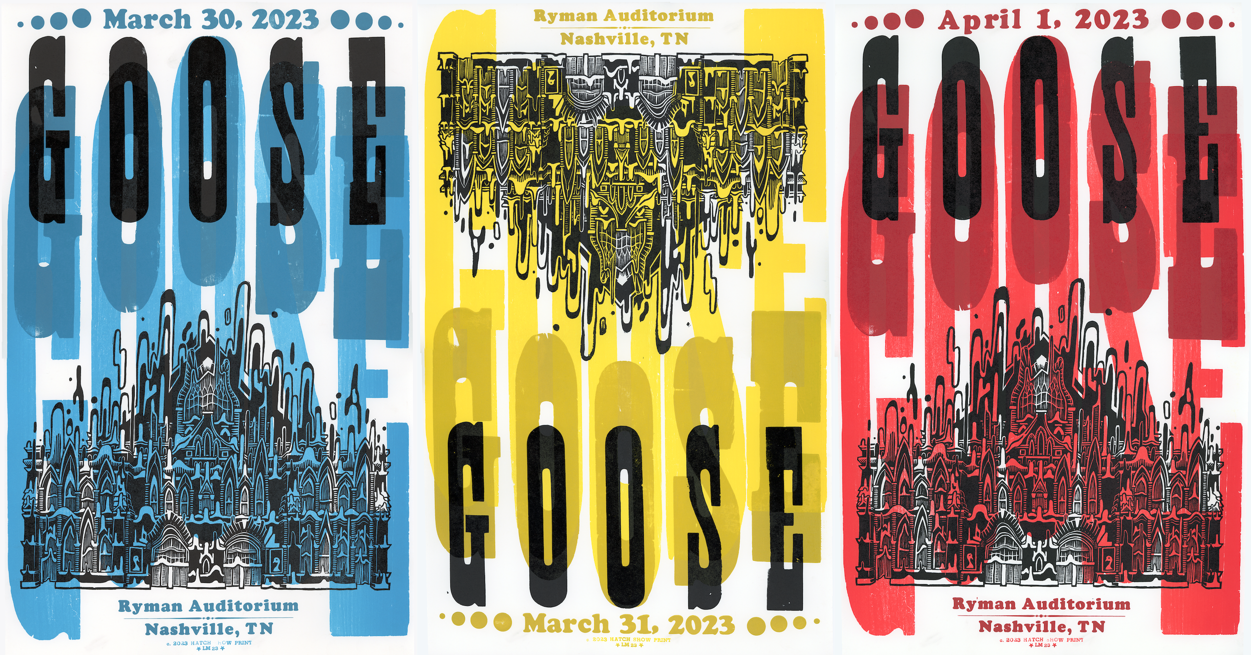
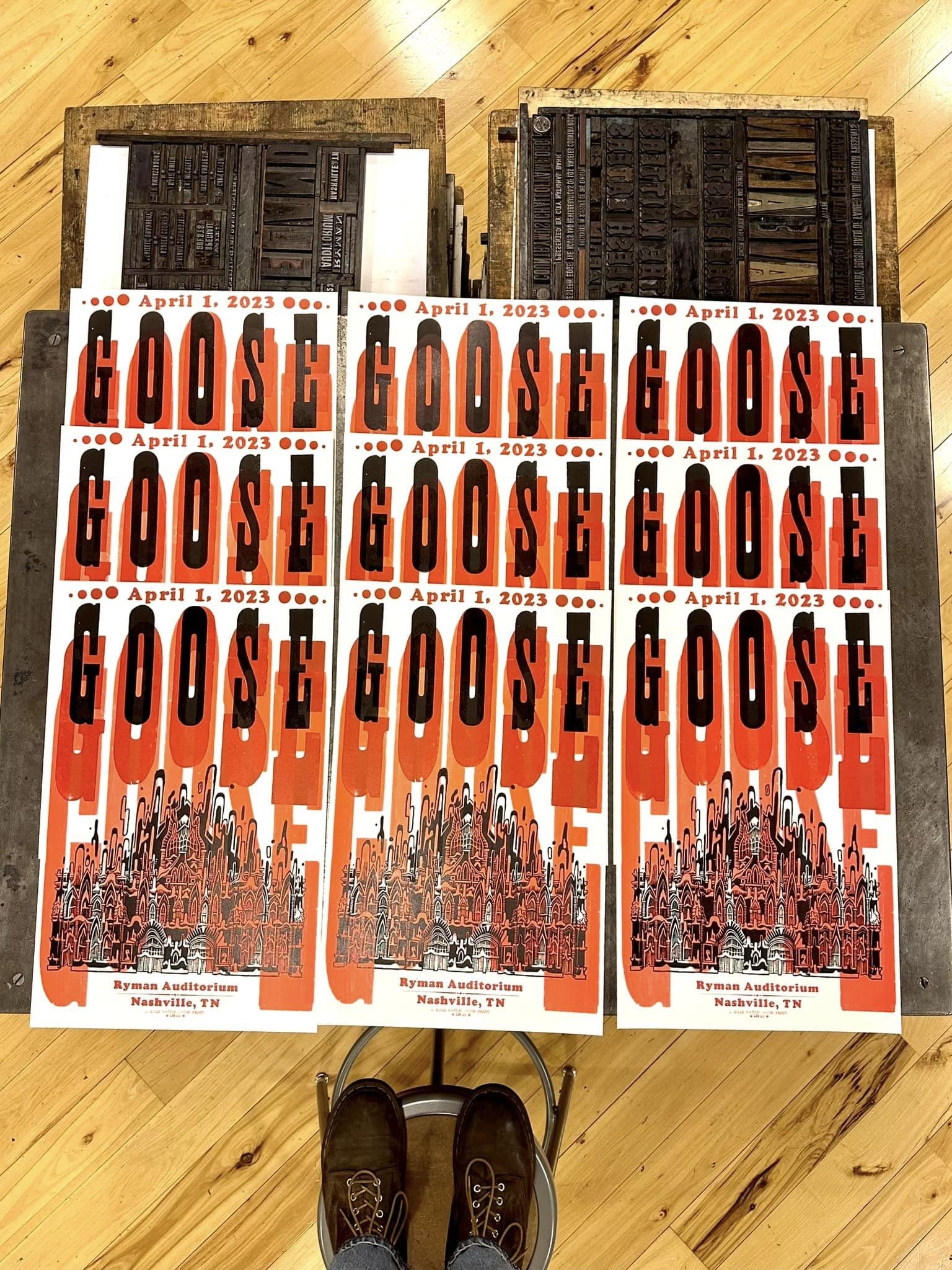
Here’s the third and final poster that I got to do for GOOSE; created during my time interning at Hatch Show Print. The setup for this print was identical to night one with the exception of a color change and date change, but you know I had to give all three their own post for the sake of the feed.
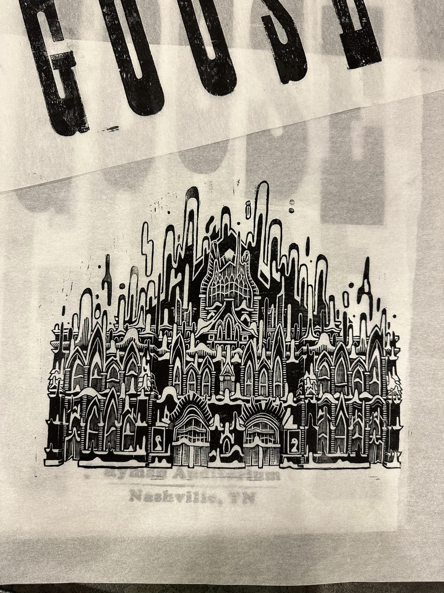
The basis of this print came about by finding the tallest and skinniest type in the shop (100 pt antique), and then working backward from there. My thought process was to tier the text to give it that appearance of melting into itself, to compliment the melting of the Ryman on the block that I carved. It was a really interesting challenge working with type that I couldn’t just click and drag to scale up in Photoshop, but like…. An interesting challenge in the best of ways.
Swipe through for some process action, plus some tasty 100-year-old letter blocks.


